Rizoo
Client
Rizoo Eyewear
Services
Brand Design
Graphic Design
Tools
Adobe Illustrator
Year
2025
Visual identity for a
Brazilian sunglasses brand.
Bold logo and brand elements reflecting style, elegance, and premium lifestyle positioning. The design conveys sophistication, direction, and a sense of forward movement — using sharp lines, clean typography, and a black and white palette that symbolizes contrast and balance, light and shadow, fashion and function.
Brand Mark
(01 / 04)01
Symbol &
Typography
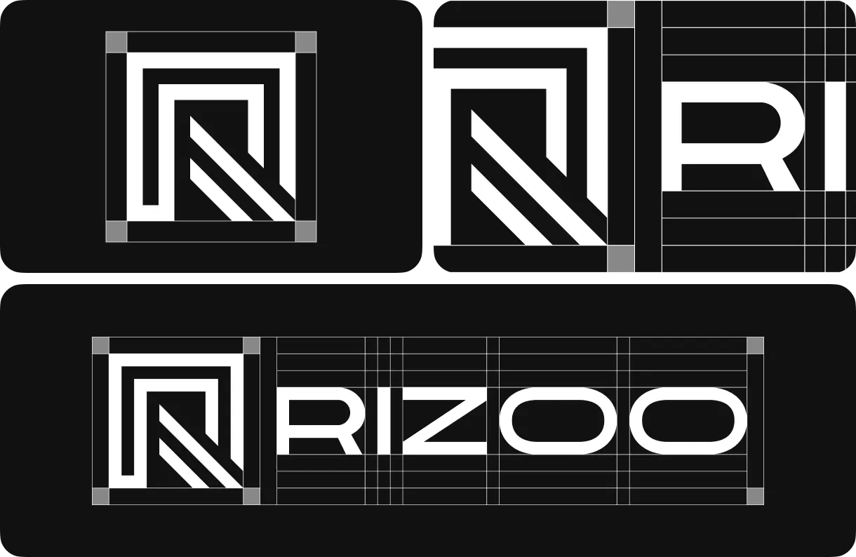
The symbol represents the brand's essence through minimalist, geometric design emphasizing bold design, elevated lifestyle, and self-expression through eyewear. Sharp lines and clean typography convey sophistication and a sense of forward movement.
The Spacing
(02 / 04)02
Clear Space
& Exclusion
Documentation of the protective clear space requirements around the logo, using a 1x proportion system based on the internal symbol elements. This ensures legibility, balance, and elegance across all applications.

Icon
(03 / 04)03
App Icon
& Favicon
The Rizoo icon functions as the visual synthesis of the identity — optimized for mobile apps, digital interfaces, and social platforms while maintaining brand consistency across multiple scales and color variations.
Color Palette
(04 / 04)04
Black &
White
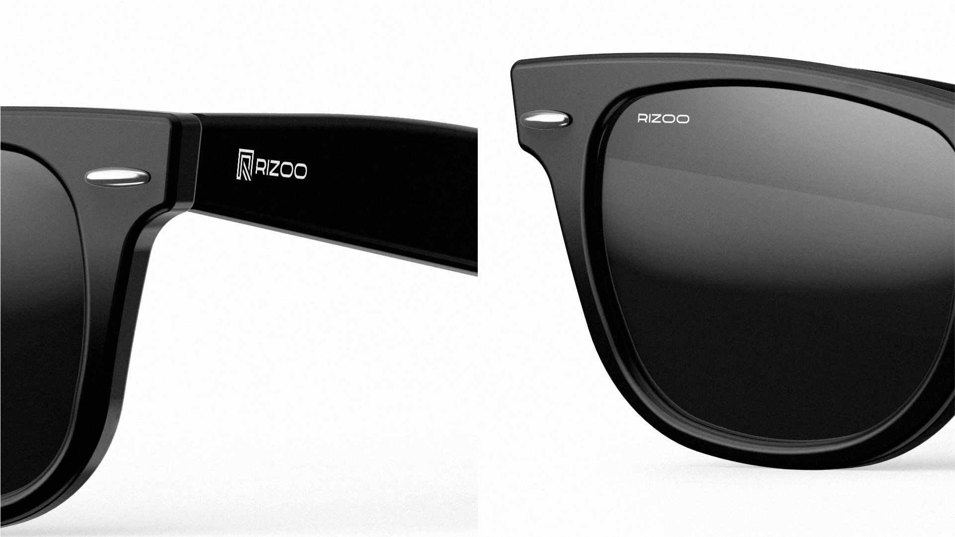
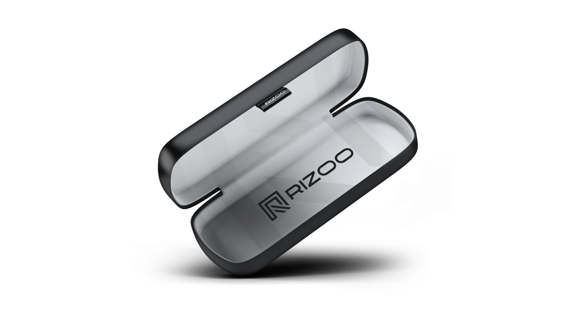
The black and white palette symbolizes contrast and balance — light and shadow, fashion and function. A timeless duality that keeps the identity versatile, bold, and unmistakably premium across every touchpoint.
Rizoo Black
#000000
Rizoo White
#FFFFFF